If you love Main Street USA at Disneyland Paris, then you have Eddie Sotto to thank.
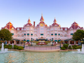
Spotted by Tony Baxter during his work on the « Laboratory of Scientific Wonders » for a Six Flags project in Baltimore, Sotto was soon hired as a Show Director for Main Street USA at Euro Disneyland, with additional contribution to the design of the Euro Disneyland Railroad and the Disneyland Hotel.
From Town Square to Walt’s, the famous Arcades to the Photography shop, Sotto and his team packed our Main Street with details and endless wonder.
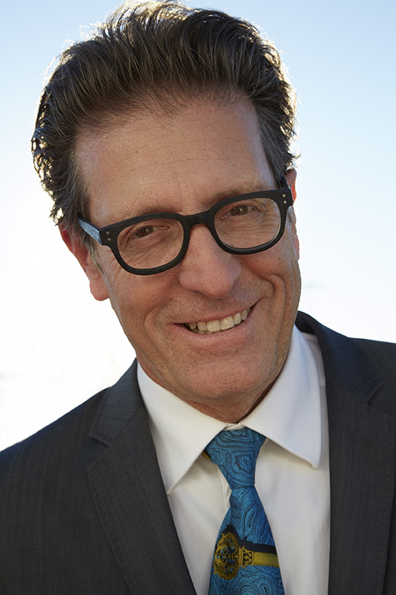
As the 25th Anniversary of Main Street USA at Disneyland Paris approaches, we sat down with him to discuss the vision, creation process and of course the anecdotes of the project.
In this first part of our interview, we start with Main Street USA!
Our first question is about the design of Main Street USA and one of its first concept, which was Chicago in the 20’s. Could you tell us more about the idea and why it didn’t materialize? Do you regret it not happening?
I don’t necessarily regret it not happening because I’m very proud of what we ended up with. I think our idea to build a 1920’s themed Main Street during the roaring 20’s would’ve been of a very successful jazz-filled period in American history when in Europe they were paying attention to the unique music and the luxury, the big city feel.. It was a little more what the Europeans noticed about America, versus a charming small town. France is awash with charming small towns, so we thought the regular Main Street was not something audiences could relate to.
We thought of the 1920’s theme because there were more movies in Hollywood depicting this era and people would understand it, and perhaps wish they could go back in time and visit. In developing it, it got to be very expensive: we had the elevated train system, a 360 degree movie attraction on Hollywood… some very ambitious plans for this Main street, very far from the original scope of the park. Michael Eisner at one point felt that this urban idea, less innocent, would not be appropriate, he wanted to stay closer to the original idea of the park.
The money may have had something to do with it as well, he saw the budget, which was a lot with the attractions. But nevertheless, we accomplished a few thing related to the weather, and made some changes to Main Street, so it wouldn’t be a complete copy of Tokyo with the roof or Florida – it had to be a hybrid of some sort.
And that goes to our next question: you graced us with those beautiful Arcades that all the other parks are jealous of. What was the reasoning in not building a covered Main Street like in Tokyo and instead opting for the Arcades, and what was the idea behind the themes?
Tony Baxter, rightfully so, and myself, felt like the experience inside the Tokyo Disneyland Main Street acoustically , was very harsh, and when you put those glass roofs up, you end up not have the vehicles running. You lose the kinetic effect, there is no movement on the street, it’s just an indoor mall.
One thing Europeans are used to is taking a walk on the street, so we didn’t wanna do anything less than what you would enjoy in Florida or California. Walking down Main Street is a very special thing, with the horse drawn carriage.. We did not want to lose that.
So how do you have that shared experience? And Michael Eisner to his credit really meditated on this and said it’s true, you don’t wanna lose that wonderful experience of standing on Main Street with the fireworks, the electrical parade and the Castle. All those things you lose when you put that roof on there. To that end, we needed a concept for something weather protected – and of course with the 1920’s Chicago theme you could stand under the elevated train tracks – but without the alternative of building a roof (which isn’t very appetizing) we thought we would do the covered Arcades.
There was a budget set aside for weatherization to allow people to connect to different lands, and that’s where the arcades came from. There aren’t many arcades like that in America. The first reference given to us internally was the Burlington Arcade in London. There is a copy of it in Los Angeles in which Roy E Disney had invested in it, so there was some awareness about those Arcades. I did some research and realized the European ones are better: there are a few in Paris that are noteworthy, but how do I make them a little more American, give them a story and a theme? Leaving for the different lands, you almost want to turn them into a storytelling device to prepare Guests to the land they are heading towards. So the Liberty Arcade takes you to Frontierland and tells you about how people use their liberty, and the Discovery Arcade takes you to Discoveryland, with the models of inventions, many of which were submitted by patents seekers.
One of the motivations behind the exhibits in the arcade was that Europeans seem to feel better about taking their kids to a museum on the weekends, versus what they could perceive to be a carnival, like Disneyland. We wanted Main Street to send the message that there was depth and intellectual quality to everything we were doing, and that if you inspect something it will reward you, you will learn something. With the arcades, I was trying to make it into a museum of American Culture, in the sense of not just being about popular culture, but also historic culture. The arcades played a role in the storytelling of the street, and since we don’t have a Penny Arcade like some of the other parks, we do have these arcades to give you an opportunity to learn something and get a little deeper.
Was it a lot of work integrating the logistics of the shops – with storerooms that could not be behind the shops? And was it a tough sell for the operations team?
It was an expensive sell: there is an elevator in the middle of each arcade, that allow to take food or merchandise up over the arcade, and then a second elevator back down leading to the sequestered areas of the stores. Cast Members can bring in food and merchandise without crossing the Guest areas, by use of these elevators over the Arcade, built into a bridge. That was part of the deal – how do you service these facilities like food, and trash? There is waste from places like Walt’s Restaurant: how do you get those things out? Those elevators are a means to doing that.
The Arcades were designed in modules: if you look at the overall design, it’s the same pattern essentially repeated all the way along the Arcades. This is economical but also gives an impression of an elegant space. From a manufacturing point of you, it was reasonable for us to do that. That way, each storefront could fit into each module for access to that particular store, and we could design the stores with a storefront on Main Street and in the Arcade.
When Frank Wells, the President of Disney came to visit, the Arcades were only at their earliest part of construction and there was not much light in them. He became worried, because he’s not very good at visualizing, that the Arcades may be too dark and not inviting enough and said he wanted something as good as Main Street itself. That gave me license to go back and get stained glass, the gaslights, and all these things that made the Arcades warm and inviting. That was all thanks to the president of the company giving me a mandate to make the Arcades their own quality walking experience, not just a secondary experience to the street itself.
At one time, Michael Eisner and I were at a party together, long after the park opening, and he introduced me to a movie producer and implied that I overspent on those Arcades. I replied: wait a minute, your partner Frank Wells instructed me to do that! He told me they had to be as good as Main Street, it was not just me running away spending that money! He thought that was funny, he had not realized.
The Arcades also work really well from a Guest Flow point of view. In Magic Kingdom, they recently opened passages on each side of Main Street but they look nowhere near our Arcades..
The situation is different. In Paris, the Arcades were considered to be something of an attraction in themselves, and not a solution to overcrowding. If you approach things saying: I want to do something meaningful and memorable, you’re going to approach it differently. The arcades to me are their own space. If you go to Paris and look at Galerie Vivienne, the various galleries, and the variety of Arcades, and in Vienna too: the Arcade itself is the attraction, you go shopping just to walk the arcade, and the natural light that’s in it is important.
The lighting in the Arcades is designed to change from day to night, because the skylights of the Arcades are not real skylight with natural light, they are backlit. At the very end of construction, we went out and got some leaves, and threw them on top of the glass windows on the ceiling, just to make it look like trees had dropped some leaves on them. I’m sure they’re no longer there, but we were pretty fanatical about those things at the time.
In Shanghai, they had a very different approach to Main Street with Mickey Avenue, which is not really a street. Have you been there, and what do you think of that approach?
It is different and I have not been there, I heard people say they really like it. You know, each culture accepts or interprets the design in a different way. It is possibly very appropriate to that culture and works over there.
You mentioned a bit ago that in your Chicago 1920’s Main Street Design, there was a 360 Movie attraction. Do you think that kind of attraction fits into Main Street and should have been featured in the final project?
That attraction was conceived prior to someone suggesting putting the Disney MGM Studios type concept next to the park at a second park. We had proposed something to deal with Hollywood, silent film, and the birth of film. We wanted to take the idea of the Main Street Cinema, which was very small, and make it larger and more dramatic. That is why we wanted to use those screens and pay homage to Hollywood. Suddenly someone suggested the Studios theme park, and that undermined this attraction because it would have been very similar.
In a corner of Main Street, you designed Town Square Photography. A few years ago, Flora’s Boutique replaced this shop. Could you tell us about the design and stories behind Town Square Photography?
This goes back to the earliest part of my career where I worked in Knotts Berry Farm, a small theme park in Southern California, started by a man who made an old western town from real artifacts. You could look in the windows and see a display of exactly how someone lived. I worked as a designer at Knotts Berry Farm, and one precious area was the realistic interiors of the buildings, looking in these windows , inside the saloon, the bank, where you saw a piece of life and real antiques. I could look into there for hours: you could see what someone was doing in that space.
On Main Street in Paris, I wanted people to feel like someone really lived there, that there was real characters. That is why the upstairs windows have sound effects. Who lives upstairs on Mains Street? It’s not dead! In real towns, you can hear things going on, so why can’t we make it more alive.
The camera store seems like a good opportunity to tell a story and the story is about a revolution that is happening. Just like we are having a camera phone revolution today, where you have a camera anywhere you are. In 1880 and 1890, George Eastman created rolled film, and then anyone could be a photographer. Before that, you had to go to a studio and someone would take your picture. What Kodak did, was making photography something anyone could have and make it portable, like a cellphone. This camera store was like being Steve Jobs on Main Street, and that man who owned it was very excited about his photo studio.
If you look at the building the way it used to be, it was a one-room store that was expended into a two-room store because he started developing the film right there. To me it was a wonderful way of telling the story and creating a space that was very personal where a Guest could look into the office. I had many people helping – names you never hear – I had people buying the props, installing props, then I was approving them and for the office, I wanted to live the part of the man that owned it.
To arrange things at the very end I went it and spend the middle of the night, pretending I was the man working there, shuffled the papers, used the coffee cup, and at the very end when I was done working, I set everything down and said: that’s it, it’s been lived in officially, and I locked the door. It is like being a method actor: you become your part. I wanted to become the design and act it out, leave an artifact behind as if someone was there.
Now, Town Square Photography has been replaced by a shop with much lighter theming. Do you feel like these days, park design is becoming bland, or the rules are dictated by operations or retail instead of storytellers?
I haven’t been at the company as an employee for more than two decades, but I know they came up with a manual for where props can go, and where they can’t go. There are now certain standards by which all stores must be designed. No matter how hard the Imagineers try, it is kind of like watching the same Hollywood movie, but with different actors. You see a formula, and I can sense that formula underneath the store. Maybe others don’t and they love that store, but I think it hurts some of the ability to make the stores unique.
There is a balance: you can’t put all props in a place that doesn’t succeed as a store. You have to collaborate with the merchandise people. However, I feel like the partnership sometimes is out of balance. Merchandise people do love interesting things in the stores, that’s what draws people in, but sometimes it become formula-like, with maybe too many characters, or the props being 8 feet above the ground so that the walls are tall with a thousand lights lighting every piece of merchandise. There is no room for variety is seems. In the real world, because different people run it all, you get stores with variety; otherwise, they are called chain stores! You really have to ask: do I want to go to a village with privately owned stores that are very interesting or do I want to go to a mall with stores that all have the same formula and design.
Remember, Kodak is virtually a bankrupt company. So of course, there was no need for a camera store anymore because people don’t need film and cameras. But Main Street is all about a lifestyle that’s obsolete. So to me, keeping the things that are in danger of being obsolete is part of the story of Main Street, so maybe the photography studio or something related could still be a story.
Join us soon for the second part of our interview with Eddie Sotto, where we discuss the evolution of theming and attraction design, what you never knew about the Disneyland Hotel, and the 25th Anniversary!

